# Towards CSS
REMARKS
- In this course section we prepare HTML files to apply (one or more) CSS layouts on them
- We link existing CSS files to HTML pages for different devices
- We do not write our own CSS code (yet), "understanding" the code is enough for now
# Linking CSS files
- Remember the (empty)
<link/>tag that can be used in the<head>section to link a relevant resource (e.g. a favicon) to an HTML page
| tag | description |
|---|---|
| <link/> | relevant resource |
- This
<link/>tag will now be used for linking a CSS file to an HTML file- As
rel(ationship), we now specify"stylesheet" - The
href(hypertext reference) contains the place where the linked CSS file can be found
- As
- Emmet tip:
link
...
<head>
    ...
    <link rel="stylesheet" href="style1.css">
</head>
...
1
2
3
4
5
6
2
3
4
5
6
# Example
- The page is well structured and the document outline is clear:

- A CSS file (style1.css) is linked to the HTML page (index.html) so that the surfer also sees this logical structure
- The content of this CSS file is clear: the font and some color combinations are set
- On a wide screen the readability of the text is poor (because the complete screen width is taken)
TIP
A (Code)Sandbox can be opened in a new browser window by selecting the 'Open in New Window' icon in the top right corner:

- We would like to limit the content width on wide screens to e.g.
800pxto speed up the reading pace of the user- Which tag can we use to realise this, taking into account that we still have 2 content tags (
<div>and<span>) to discuss?
- Which tag can we use to realise this, taking into account that we still have 2 content tags (
| tag | description |
|---|---|
| <div> | block element |
| <span> | inline element |
# Extra structure element <div>
- Use a
<div>tag to address a part of the page (that is not a<header>,<nav>,<main>,<article>,<section>,<aside>,<footer>or<figure>) for layout purposes- Not used as often (as before), because you can use an alternative structure tag (
<main>,<section>, ... ) in a lot of cases
- Not used as often (as before), because you can use an alternative structure tag (
- Block element
- Used to group a number of other block elements
# Example
- Differences with previous example
- The whole content of the body is surrounded by
<div> ... </div> - An additional CSS file (style2.css) is linked to the HTML page index.html (AFTER the link to style1.css)
- Contains some additional color combinations and extra code to limit the width of the
<div>, center the<div>on the page, ...
- Contains some additional color combinations and extra code to limit the width of the
- The whole content of the body is surrounded by
- The styles of the CSS files are applied in cascade (in series, in succession)
- The font is Verdana (only defined in style1.css)
- The
<header>and<footer>are rendered in white text on a black background (the color choices for these elements defined in style2.css overrule those of style1.css) - ...
# Extra structure element <span>
- Use a
<span>tag to address a part of text within a block element for layout purposes - Inline element
- A
<span>tag can only contain phrasing content, that is, content that can be inside a sentence (text,<img>,<a>, ...)
# Example
- Differences with previous example
- The first word of the introduction and the five first words of the middle part are included in a
<span>tag - In style2.css extra CSS code is written to underline these
<span>tags
- The first word of the introduction and the five first words of the middle part are included in a
# id and class
- In the CSS code we have used so far, all tags (
<header>,<footer>,<a>,<div>,<span>, ...) are styled in the same manner- Exercise: Open the previous Sandbox and add a
<div>tag with some lorem text (somewhere in the<body>) and observe the result!
- Exercise: Open the previous Sandbox and add a
- If you want to use a specific style for (a) specific element(s), you will need the standard/common attributes
idandclasswhich can be attached to any HTML element
| attribute | description |
|---|---|
| id | identifier; one |
| class | class; more than one |
- Naming conventions
- Case sensitive
- No spaces
- Must start with a letter
# id
- Assigns a unique name to one HTML element
- A specific
idcan only occur once in a webpage- A webpage containing 2 elements with the same identifier is not valid/correct
- In another webpage of the site an element with the same identifier is allowed
- A specific
- Usage
- As an anchor in (hyper)links (see A link to a specific point on a webpage)
- Style a specific HTML element with CSS (see below)
- In CSS, we use
#followed by the name of theidto select this specific HTML element
- In CSS, we use
- Make web forms more accessible (see Full Stack Essentials)
- Access an HTML element in JavaScript/jQuery (see Full Stack Essentials)
# class
- Can be attached to different HTML elements
- A specific
classcan occur multiple times in a webpage
- A specific
- Usage
- Style multiple elements (in the same way) with CSS (see below)
- In CSS, we use
.followed by the name of theclassto select these multiple HTML elements
- In CSS, we use
- Access (an) HTML element(s) in JavaScript/jQuery (see Full Stack Essentials)
- Style multiple elements (in the same way) with CSS (see below)
REMARK
- The difference between
idandclasscan be remembered easily, as it resembles the organisation of the IT Factory- Every student has a unique identifier, i.e. his/her student number. No other student has the same number.
- A class group consists of multiple students and students can take courses in different class groups
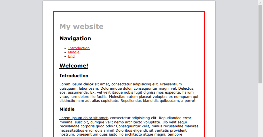
# Example
- Differences with previous example
- Several identifiers (
container,top) and classes (bold,underline) are added in index.html - In style2.css, CSS code for these identifiers and classes is added
<div id="container">...</div>(line 12)- The CSS code, originally written for all
<div>tags, is moved to#container - As such, only this 'container' (the
<div>withid="container") gets the specified layout (maximal width, centered, red border, etc.)
- The CSS code, originally written for all
<h2 class="underline">Welcome!</h2>(line 31) and<span class="underline">Lorem ipsum dolor sit amet,</span>(line 47)- The styling specified in
.underline(underline text) is applied to this heading<h2>and this<span>
- The styling specified in
<span class="bold underline">dolor</span>(line 35)- The styling specified in
.bold(bold text) and.underline(underline text) is applied to this<span> - Note that the value of the
classattribute ("bold underline") equals both class names, separated by a space
- The styling specified in
<a href="#" id="top" class="bold">top</a>(line 155)- The styling specified in
.bold(bold text) and#top(capital letters) is applied to this link
- The styling specified in
- Several identifiers (
REMARK
- Use meaningful names for identifiers and classes, indicating the purpose of the corresponding code
- For example:
class="warning"is a better choice thanclass="blue"
- For example:
# Summary
| HTML | CSS | remark |
|---|---|---|
<div id="id1">...</div> | #id1 {...} | identifier: unique on webpage |
<span class="cl1 cl2">...</span><a class="cl1">...</a> | .cl1 {...}.cl2 {...} | class: allowed multiple times on webpage |
# Media queries
# Different devices
- If you study the print preview (of the last example), you notice that it's not printer-friendly: the red border is annoying, navigation links are useless on paper, etc.
- While linking a style sheet you can designate the device for which it is meant by adding the (optional) attribute
mediato the<link>tag- Without a media attribute, the lay-out will be used on alle devices
- If you want to use the style sheet solely for a color monitor, this should be specified with
media="screen" - If you want to use the style sheet solely for printing, this should be specified with
media="print"- Emmet-tip:
link:print
- Emmet-tip:
| media type | description |
|---|---|
| all | all devices |
| print preview/printer | |
| screen | computers screens, tablets, smartphones, etc. |
| speech | screenreaders |
# Example
- Differences with previous example
- The CSS files style1.css and style2.css are only used on monitors (
media="screen"is added to their respective<link>tags):
<link rel="stylesheet" href="style1.css" media="screen"/>
<link rel="stylesheet" href="style2.css" media="screen"/> - An extra CSS file style3.css is added, which will only be used for printing:
<link rel="stylesheet" href="style3.css" media="print"/>- Contains CSS code to hide the
<header>,<nav>and<footer>
- Contains CSS code to hide the
- The CSS files style1.css and style2.css are only used on monitors (
- On a monitor, nothing changes
- In the print preview, all styling (defined in style1.css and style2.css) and the information that's irrelevant on paper is gone
# Different screen sizes
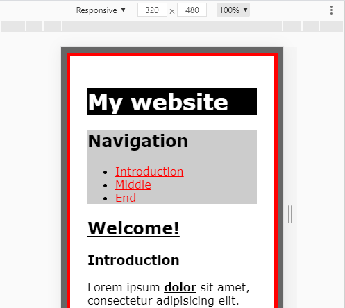
- On small screens the layout is far from perfect as quite some space is lost by the grey/red/white spacing around the text
TIP
- Go into developer mode (
F12) and click the mobile icon to emulate the webpage on a mobile device- Chrome:

- Firefox:

- Chrome:
- It's possible to include an additional test regarding the screen size in the
mediaattribute, e.g.,media="screen and (min-width: 600px)"
REMARK
- Do not forget the brackets around the additional test:
(min-width: 600px)
# Example
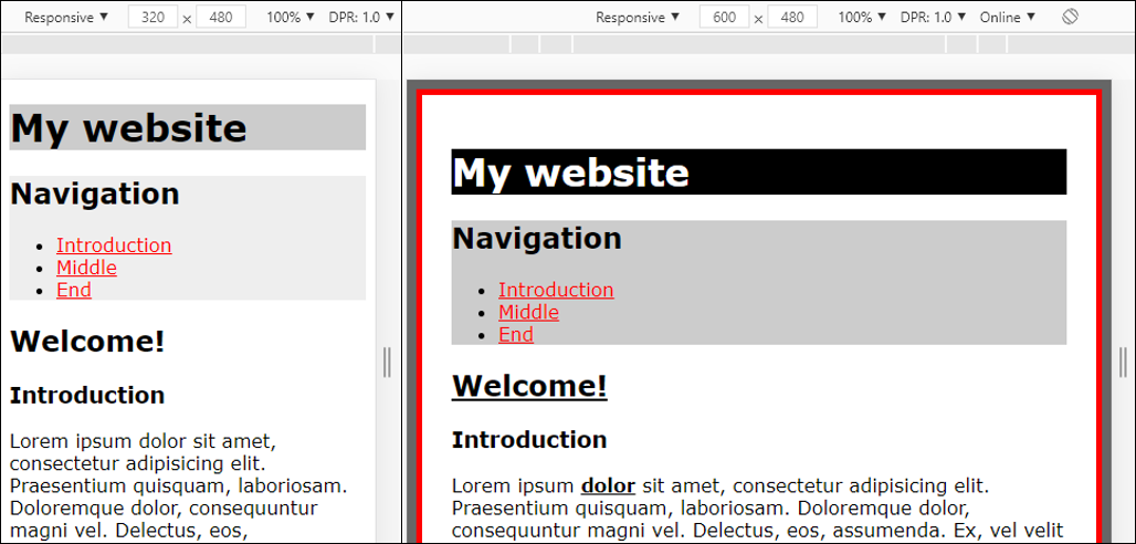
- Differences with previous example
- The CSS file style2.css is only used on screens with a minimal width of
600px:
<link rel="stylesheet" href="style2.css" media="screen and (min-width: 600px)"/> - Different lay-out depending on the screen width
- The CSS file style2.css is only used on screens with a minimal width of
TIP
Always work MOBILE FIRST: start by coding a basic layout for all screens, after which you specify what should be different on a wider screen
# Viewport
- The attentive reader has observed that the HTML page index.html in this section contains the viewport
<meta/>tag (line 5) in the<head>section- The viewport refers to the area of the browser window in which content can be seen
- This
<meta/>tag is extremely important when you want to code different layouts for different screen widths- Exercise: Comment the viewport
<meta/>tag in the previous example and check what happens in mobile view (in the developer mode of your browser): the device does not report its actual screen width, and the style sheet style2.css is also applied on screens smaller than600px
- Exercise: Comment the viewport
- Emmet tip:
meta:vp
WARNING
Do not forget to remove the unnecessary attributes (user-scalable, maximum-scale and minimum scale). More precisely,
<meta name="viewport" content="width=device-width, user-scalable=no, initial-scale=1.0, maximum-scale=1.0, minimum-scale=1.0">
1
should become
<meta name="viewport" content="width=device-width, initial-scale=1.0">
1