
2D Transforms
11/14/25About 7 min
2D Transforms
- A transform is an effect that lets an element change its shape, size and position
Tips
- Use this interactive example page to play with most of the properties and methods discussed below
- Note that you can double-click on a label to reset the related value
- The transform methods and transform-related properties are:
| methods and properties | description |
|---|---|
translate(unit ,[unit]),translateX(unit), translateY(unit) | move an element on the X and/or Y axis |
rotate(angle), rotateX(angle), rotateY(angle) | rotate an element around a fixed X, Y point |
scale(nr [, nr]), scaleX(nr), scaleY(nr) | scale an element along the X and/or Y axis |
skew(angle), skewX(angle), skewY(angle) | skew an element along the X and/or Y axis |
transform-origin: unit, unit | set the transformation point |
| `backface-visibility: visible | hidden` |
translate()
- Move an element along the X and/or Y axis
- Positive arguments describe a move to the right/bottom
- Negative arguments move an element left/upwards
- You can use units like
px,rem,%, ... translate(arg)with one argument behaves exactly the same astranslateX(arg)
<h1>translate</h1> <section> <div> <span>translate(20px)</span> </div> <div> <span>translate(20px, -1rem)</span> </div> <div> <span>translateX(20px)</span> </div> <div> <span>translateY(1rem)</span> </div> </section>
         * { margin: 0; padding: 0; box-sizing: border-box; }
 html { font-size: 16px; }
 body { font-family: Verdana, Geneva, sans-serif; line-height: 1.5; }
 h1 { font-size: 1rem; margin: 1rem; }
 section { display: flex; flex-wrap: wrap; }
 div { border: 1px solid darkgray; background-color: rgba(169, 169, 169, .2); display: inline-block; margin: 1rem; }
 span { display: inline-block; width: 160px; line-height: 160px; font-size: .8rem; text-align: center; border: 1px solid #000; background-color: rgba(248, 204, 52, .6); }
 div:nth-child(1) span { transform: translate(20px); }
 div:nth-child(2) span { transform: translate(20px, -1rem); }
 div:nth-child(3) span { transform: translateX(20px); }
 div:nth-child(4) span { transform: translateY(1rem); }
| EMMET instruction | result | description |
|---|---|---|
trf:t + TAB | transform: translate(); | move an element on the X axis (and on the Y axis) |
trf:tx + TAB | transform: translateX(); | move an element on the X axis |
trf:ty + TAB | transform: translateY(); | move an element on the Y axis |
REMARK
The Emmet instructions mentioned above (and the transform-, transition- and animation-related Emmet instructions in the following chapters) produce some additional lines with vendor prefixes (-webkit-, -moz-, -ms- and/or -o-)
- In general, these lines may/should be deleted because all major browsers support transforms, transitions and animations
- Or, instead of using Emmet for these (less common) properties, you rely on the suggestions made by your code editor when you start typing
rotate()
- Rotate an element around a fixed point (the default rotation point is
centeron both the X and Y axis)- Positive angles rotate clockwise
- Negative angles rotate counterclockwise
- The angle can be described as
deg(degrees),turn,rad(radians) orgrad(gradians)- The relationship between
degandturnis:360deg=1turn,180deg=.5turn,45deg=.125turn,10deg=.028turn, ...
- The relationship between
<h1>rotate</h1> <section> <div> <span>rotate(20deg)</span> </div> <div> <span>rotateX(60deg)</span> </div> <div> <span>rotateY(60deg)</span> </div> </section>
         * { margin: 0; padding: 0; box-sizing: border-box; }
 html { font-size: 16px; }
 body { font-family: Verdana, Geneva, sans-serif; line-height: 1.5; }
 h1 { font-size: 1rem; margin: 1rem; }
 section { display: flex; flex-wrap: wrap; }
 div { border: 1px solid darkgray; background-color: rgba(169, 169, 169, .2); display: inline-block; margin: 1rem; }
 span { display: inline-block; width: 150px; line-height: 150px; font-size: .9rem; text-align: center; border: 1px solid #000; background-color: rgba(248, 204, 52, .6); }
 div:nth-child(1) span { transform: rotate(20deg); }
 div:nth-child(2) span { transform: rotateX(60deg); }
 div:nth-child(3) span { transform: rotateY(60deg); }
REMARK
Notice that in a 2D plane, rotateX() and rotateY() result in a squeezed element
| EMMET instruction | result | description |
|---|---|---|
trf:r + TAB | transform: rotate(); | rotate an element around a fixed point |
trf:rx + TAB | transform: rotateX(); | rotate an element horizontally around a fixed point |
trf:ry + TAB | transform: rotateY(); | rotate an element vertically around a fixed point |
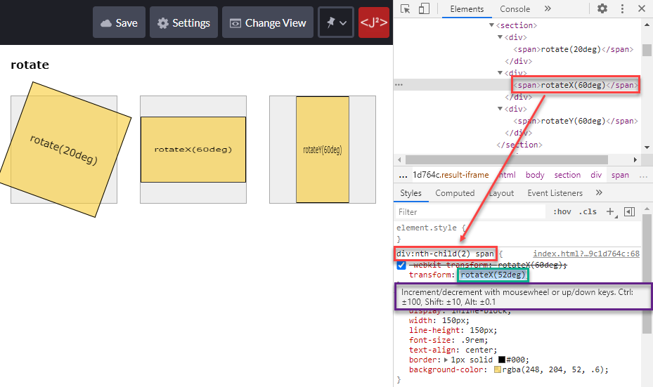
CHROME TIP
- Open the CodePen in full screen
- Open DevTools and select the second
spantag - Double click on the angle of
rotateX() - Use the mousewheel or arrow keys to increment/decrement the value
scale()
- Scale or "zoom" an element along the X and/or Y axis
- Arguments larger than 1 correspond to zooming in
- Arguments smaller than 1 will zoom out
scale(arg)with one argument scales along both the X and Y axis, i.e., it behaves asscaleX(arg)ANDscaleY(arg)
<h1>scale</h1> <section> <div> <span>scale(1.2)</span> </div> <div> <span>scale(1.2, .8)</span> </div> <div> <span>scaleX(1.2)</span> </div> <div> <span>scaleY(.8)</span> </div> </section>
         * { margin: 0; padding: 0; box-sizing: border-box; }
 html { font-size: 16px; }
 body { font-family: Verdana, Geneva, sans-serif; line-height: 1.5; }
 h1 { font-size: 1rem; margin: 1rem; }
 section { display: flex; flex-wrap: wrap; }
 div { border: 1px solid darkgray; background-color: rgba(169, 169, 169, .2); display: inline-block; margin: 2rem; }
 span { display: inline-block; width: 150px; line-height: 150px; font-size: .9rem; text-align: center; border: 1px solid #000; background-color: rgba(248, 204, 52, .6); }
 div:nth-child(1) span { transform: scale(1.2); }
 div:nth-child(2) span { transform: scale(1.2, .8); }
 div:nth-child(3) span { transform: scaleX(1.2); }
 div:nth-child(4) span { transform: scaleY(.8); }
| EMMET instruction | result | description |
|---|---|---|
trf:sc + TAB | transform: scale(); | scale an element along the X axis (and along the Y axis) |
trf:scx + TAB | transform: scaleX(); | scale an element along the X axis |
trf:scy + TAB | transform: scaleY(); | scale an element along the Y axis |
skew()
- Skew an element along the X and/or Y axis
- The angle can be described as
deg,turn,radorgrad skew(angle)with only one angle behaves exactly the same asskewX(angle)
<h1>skew</h1> <section> <div> <span>skew(20deg)</span> </div> <div> <span>skew(20deg, 20deg)</span> </div> <div> <span>skewX(20deg)</span> </div> <div> <span>skewY(20deg)</span> </div> </section>
         * { margin: 0; padding: 0; box-sizing: border-box; }
 html { font-size: 16px; }
 body { font-family: Verdana, Geneva, sans-serif; line-height: 1.5; }
 h1 { font-size: 1rem; margin: 1rem; }
 section { display: flex; flex-wrap: wrap; }
 div { border: 1px solid darkgray; background-color: rgba(169, 169, 169, .2); display: inline-block; margin: 2rem; }
 span { display: inline-block; width: 150px; line-height: 150px; font-size: .8rem; text-align: center; border: 1px solid #000; background-color: rgba(248, 204, 52, .6); }
 div:nth-child(1) span { transform: skew(20deg); }
 div:nth-child(2) span { transform: skew(20deg, 20deg); }
 div:nth-child(3) span { transform: skewX(20deg); }
 div:nth-child(4) span { transform: skewY(20deg); }
| EMMET instruction | result | description |
|---|---|---|
transform: skew(); | skew an element along the X axis (and along the Y axis) | |
trf:skx + TAB | transform: skewX(); | skew an element along the X axis |
trf:sky + TAB | transform: skewY(); | skew an element along the Y axis |
Combining methods
- You can combine two or more transform methods by separating them with a space
REMARK: ORDER MATTERS!
- Image on the left:
transform: rotate(45deg) translateX(70px)means:
firstrotate(45deg), thentranslateX(70px)the already rotated element - Image on the right:
transform: translateX(70px) rotate(45deg)means:
firsttranslateX(70px), thenrotate(45deg)the already translated element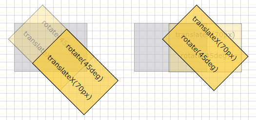
transform-origin
- Until now, our transformations took place around the default reference or transformation point, which is the center of the element
- The
transform-origin: x yproperty can change this transformation point - Possible values are:
top,center,bottom,leftorright- units like
px,%rem, ...
- In the example below, all blocks rotate by
10degbut the rotation is not immediately visible as the rotation takes place on the:hoverstate:- First block: no value for
transform-origin(default istransform-origin: center center) - Second block:
transform-origin: left top - Third block:
transform-origin: right bottom - Last block:
transform-origin: 15% 45%
- First block: no value for
<h1>transform-origin (on hover)</h1> <section> <div> <span>center center</span> </div> <div> <span>left top</span> </div> <div> <span>right bottom</span> </div> <div> <span>15% 45%</span> </div> </section>
         * { margin: 0; padding: 0; box-sizing: border-box; }
 html { font-size: 16px; }
 body { font-family: Verdana, Geneva, sans-serif; line-height: 1.5; }
 h1 { font-size: 1rem; margin: 1rem; }
 section { display: flex; flex-wrap: wrap; }
 div { border: 1px solid darkgray; background-color: rgba(169, 169, 169, .2); display: inline-block; margin: 2rem; }
 span { display: inline-block; width: 150px; line-height: 150px; font-size: .9rem; text-align: center; border: 1px solid #000; background-color: rgba(248, 204, 52, .6); }
 div:nth-child(1):hover span { transform: rotate(10deg); }
 div:nth-child(2):hover span { transform: rotate(10deg); transform-origin: left top; }
 div:nth-child(3):hover span { transform: rotate(10deg); transform-origin: right bottom; }
 div:nth-child(4):hover span { transform: rotate(10deg); transform-origin: 15% 45%; }
| EMMET instruction | result | description |
|---|---|---|
trfo + TAB | transform-origin: ; | set the transformation point |
backface-visibility
- When you rotate an element between
90degand270degaround the X and/or Y axis, the backface is by defaultvisibleand the content is shown in mirror image - You can easily hide (the backface of an) element with the property
backface-visibility: hidden; - In the example below:
- Change the
transformY()angle to a value between0and360deg - Angle between
0...90degor between270deg...360deg: bothspantags are visible - Angle between
90deg...270deg: the secondspantag ishidden
- Change the
span {
    ...
    transform: rotateY(45deg);    /* change value between 0 and 360deg */
}
div:nth-child(2) span {
    backface-visibility: hidden;  /* hidden between 90deg and 270deg */
}
<h1>backface-visibility</h1> <section> <div> <span>Backface is visible</span> </div> <div> <span>Backface is hidden</span> </div> </section>
         * { margin: 0; padding: 0; box-sizing: border-box; }
 html { font-size: 16px; }
 body { font-family: Verdana, Geneva, sans-serif; line-height: 1.5; }
 h1 { font-size: 1rem; margin: 1rem; }
 section { display: flex; flex-wrap: wrap; }
 div { border: 1px solid darkgray; background-color: rgba(169, 169, 169, .2); display: inline-block; margin: 2rem; }
 span { display: inline-block; width: 150px; line-height: 300px; font-size: .8rem; text-align: center; border: 1px solid #000; background-color: rgba(248, 204, 52, .6); transform: rotateY(45deg); /* change value between 0 and 360deg */ }
 div:nth-child(2) span { backface-visibility: hidden; /* hidden between 90deg and 270deg */ }
| EMMET instruction | result | description |
|---|---|---|
bfv:h + TAB | backface-visibility: hidden; | the backface of an element is not visible |
bfv:v + TAB | backface-visibility: visible; | the backface of an element is visible |